Even the closest of siblings have a bit of a rivalry as their intertwined lives evolve – with wind and solar power being no different. Recent business trends show that the analogies have big money truths behind them. For instance, NextEra has 20 GW+ pipeline of wind+solar+storage potential, and they’ve begun to let their existence leak out with the first in Oregon – 300 MW of wind, 50 MWac of solar, and 30 MW / 120 MWh of energy storage – and a second in Oklahoma – 250 MW wind farm, 250 MWac solar farm, and 200 MW / 800 MWh of energy storage. And with research suggesting that a mix of wind+solar+storage being able to get us to 80% renewables, this analogy will only become more valid.
Lawrence Berkeley National Laboratory’s (LBNL) Wind Technologies Market Report, shows great growth – with more projected, efficiency increases, and continued pricing decreases in the wind industry. Really – if you like wind – you ought read this report (here’s the full version in PDF format)!
Within the document, there was a bit of solar research for us to chew on as well – starting with a great graph (below) showing the evolution of the future interconnection queues of the United States. And while very little of this capacity has started construction, overall trends are definitely representative of the future.
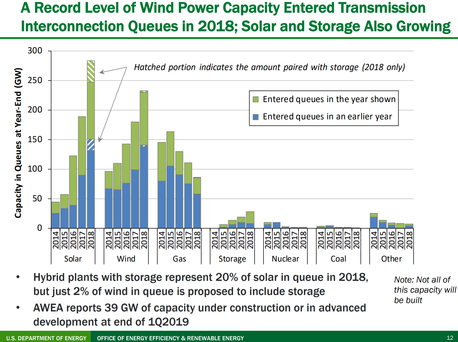
The most significant aspect of this document is the increasing sizes of wind, solar and – just starting – energy storage in the queues. If we add up the roughly 280 GW of solar and 230 GW of wind, we break 500 GWac of capacity that has been considered across the United States. What this truly represents is that there are this many sites, in various locales across the country, that developers have already found and decided to invest some capital in.
Research by pv magazine USA (that is six months fresher and slightly different in its reporting methodology), that will appear in depth our Special Edition Solar Power International hard copy, shows that (below image) the majority of this queue volume is schedule to come online before the end of 2023, is widely spread across the country, and has a lot of more energy storage coming. While most of these projects won’t get built within their projected completion dates, they are considered hopeful opportunities by some salesperson somewhere, and could get built through the 2020s.
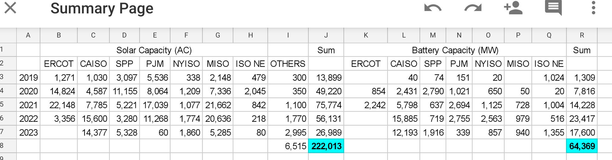
Note that in the above image, which is of the queues on July 31, 2019, show almost 65 GW of energy storage being considered – versus less than 25 GW in the LBNL report. This is a doubling in six months.
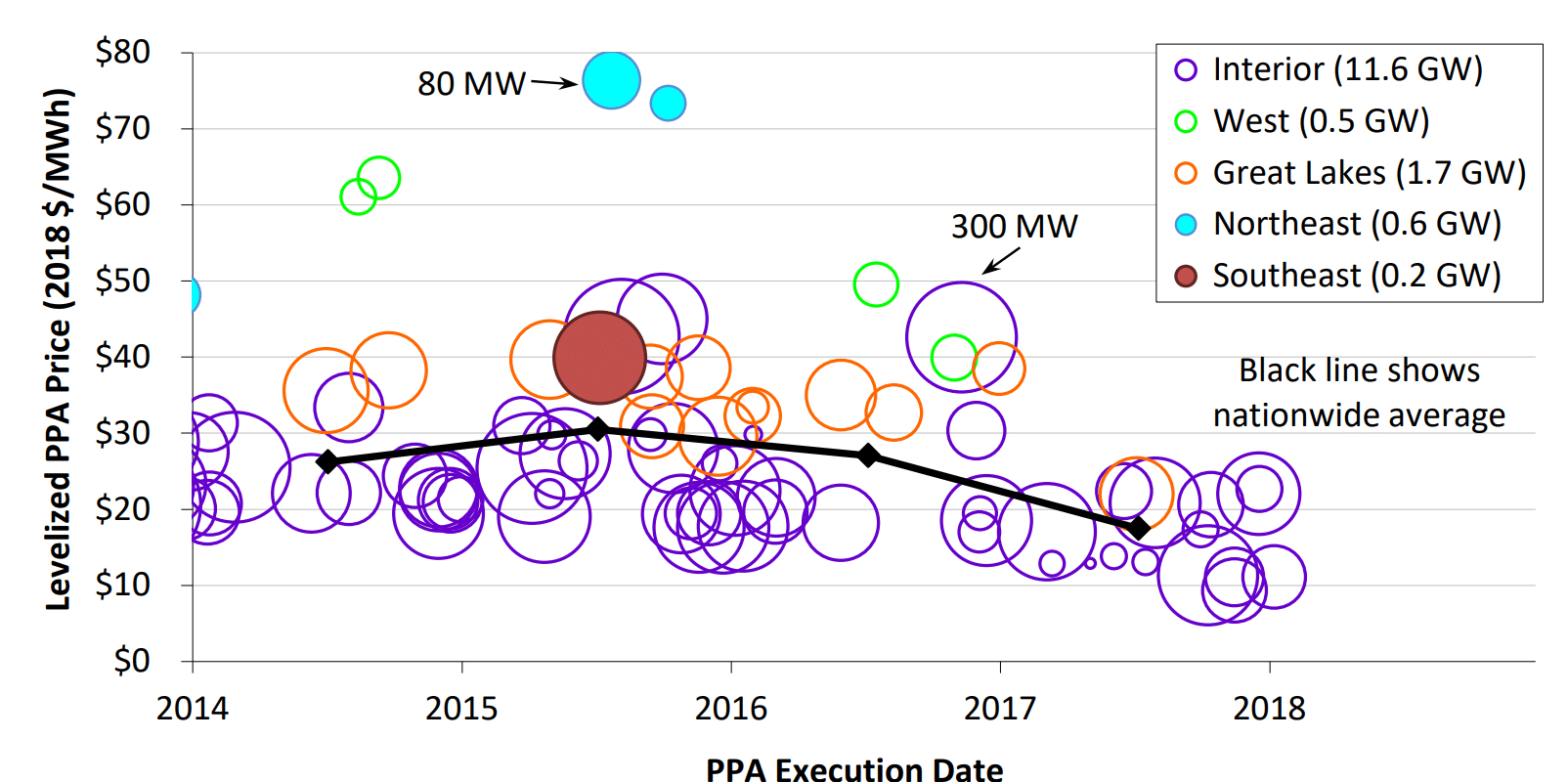
Another great chart within the document shows the progression of power purchase agreement (PPA) pricing from 2008 through 2019 for both wind and solar power. The utility scale solar data included 252 unique PPAs totalling 15.7 GWac of capacity. As we all know, pricing is down, and it is getting really close to the pricing of large scale wind. Historically, we know that most of these contracts have been geographically focused – wind contracts in the middle of the country, and most of the solar in the southwest. However, as the report notes – as pv magazine USA has reported on – these low price contracts are moving far from the deserts of Arizona.
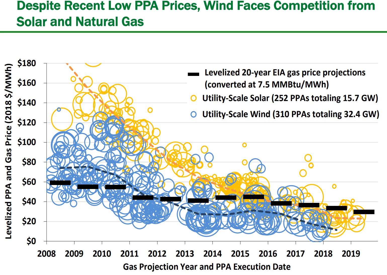
The last major point made about wind and solar, is related to the above chart their respective price competitiveness with gas. In the below chart, the black dash markers show the 20-year levelized fuel costs from then-current EIA projections of natural gas prices delivered to electricity generators. The circles represent PPA prices of wind contracts, and as you can now get why – the “Interior” ppa prices of wind have been competing with gas for a very long time. Now, in your minds – superimpose the solar contracts on top of these – and you’ll see why the queue chart from above is what it is.
This content is protected by copyright and may not be reused. If you want to cooperate with us and would like to reuse some of our content, please contact: editors@pv-magazine.com.


As always, another well written article from John Weaver who we follow daily on PVmagUSA. Keep going, thanks !
Is there any information out there about how much queued wind and solar generation results in completed projects? I know they don’t all get built, but I’m not sure what the rate is.
ISO-NE said 15%
The chart showing the levelized PPA and gas price is interesting. We must keep in mind that even with natural gas, it is a commodity fuel, although it can be said the fuel is a “dispatchable” generation resource, it still is hostage to weather, political, labor forces that can inject price increases without little warning. Example: It was customary for some utilities to buy natural gas futures for up to 5 years in advance to help keep operating costs down at the utility. When Katrina hit New Orleans in 2005, it disrupted the flow of natural gas and the commodity price spiked for a couple of months. The Utilities that bought natural gas futures at this time were subjected to high prices that collapsed two months later. This left the utility with stranded assets, they could not competitively sell to the ratepayers. Electricity rates were increased with a “fuel tariff” tacked onto every electric bill to capture the differential of what the long term gas contract was purchased at and what the actual natural gas was worth.
What I found interesting was the first image with the graph showing peak NG capacity proposals was in 2015.