Historically, the U.S. Department of Energy’s Energy Information Administration (EIA) prediction’s on solar capacity installation volume haven’t done much to predict reality. Instead, as the EIA states, they imagine a world in which all things stay the same – forever. Really, their models assume no change in political/economic structures – that’s why their predictions are so…off.
So I took a look at @EIAgov's projections for #solar #energy over time. pic.twitter.com/dwrJeM84cf
— Stef @wikisteff@mastodon.social Christensen (@Wikisteff) August 24, 2016
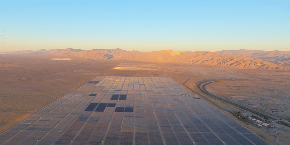
In an article yesterday – Solar photovoltaic costs are declining, but estimates vary across sources, the EIA highlighted some of the challenges of describing the pricing of solar power hardware.
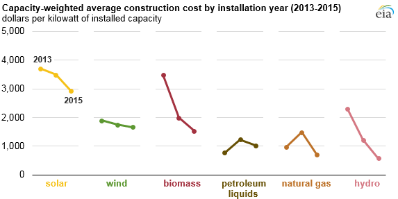
Each of the three government groups tasked with collecting this information do it in different ways, and so the information that they then deliver is different. One key component is that they are measuring plants of different scales, with some data sets going to plants as small as 1 MW and others focused on 100 MW projects.
And because the time spent trying to interpret it is often less than the time spent talking about it – the disconnect between readers and researchers grows.
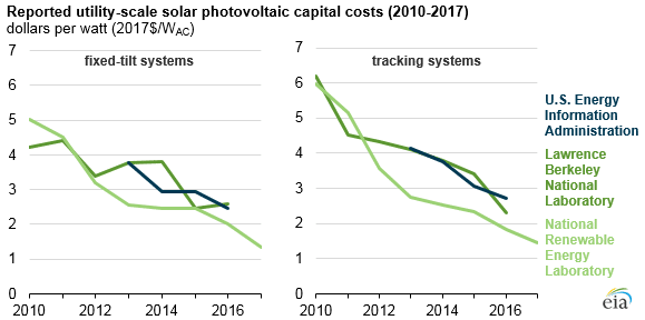
First up is the EIA data – who calls (or emails) the owners of the 1 MW or larger systems that the EIA tracks, and asks them what they paid. And since the EIA has the best list of projects running in the U.S., as its their job, they probably have a solid data set.
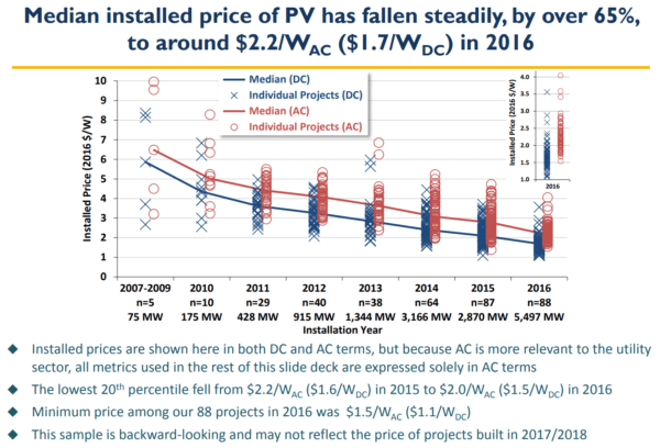
There are flaws here. First off, publicly regulated electricity utilities pump pricing because of the nature of how they increase profits. Secondly – private project developers don’t like talking about pricing. That’s highly sensitive information. Thirdly – this is trailing information, and held onto for a year out of respect of developers. The EIA’s 2018 Annual Energy Outlook report is based on the 2015 data below – don’t forget, its spring of 2018. This is inherently problematic as the solar industry is one of the most aggressively evolving industries on our planet – and rate of change has arguably increased since late 2015.
There is 2016 data out there today – released by the EIA, but its not yet worked its way through the system fully.
The greatest strength of this data is that it represents an ‘all in’ cost. Developer costs, land prices, grid upgrade costs, finders fees – and all the other hands in the pie. A second strength is the people might give a little more respect to a data collection request from the EIA – there’s a lot of money involved in being nice to the power company. Lastly – it’s a fairly broad dataset – all systems above 1 MW is a more than respectable batch.
The second set of data we have (above graph) from Lawrence Berkeley National Laboratory (LBNL) – which as a national lab is also overseen by the Department of Energy – looks a lot like the EIA. This is because it starts with the EIA’s base information, but then it adds a lot of data to refine. Corporate reports, FERC, the 1603 Treasury Grant database were given as examples. Additionally, this report only looks at projects 5MW or larger – thus a smaller data set.
The EIA’s and LBNL’s datasets are really close because they start with the same data – but you can clearly see variance arising in the third graph up.
The last set of data throws everyone off when set next to the two above – it comes from the Department of Energy’s National Renewable Energy Laboratory (NREL). The annual, The U.S. Solar Photovoltaic System Cost Benchmark: Q1 2017, is one of my favorite publications of the year.
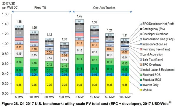
The researchers look at individual subcomponents that make up these projects – from labor, through engineering, transmission and interconnection costs, into developer costs, and then each piece of hardware – and then they build a model by adding these all up. In a perfect world – this is what solar power costs.
The report does the same for residential and commercial projects, and then adds in labor and permitting variance on a state level.
Of course, we live in a much more complex world. Project developer fees vary in every project – because sometimes projects are built on utility owned land, and sometimes a farmer calls their local solar company, who calls a finance shop, that calls a national developer who subs to a local – and they sell it to the utility. And solar panel prices are not all 35¢/W because we don’t all buy the same panels.
The dynamics that lead toward projects getting built are broad.
Additionally, this data from NREL is cutting-edge compared to the EIA’s backwards looking surveys. Researchers in a lab have access to the most recent price quotes floating on various supplier websites.
Making use of published data requires we understand what the data represents. That takes patience, sometimes that’s expensive.
This content is protected by copyright and may not be reused. If you want to cooperate with us and would like to reuse some of our content, please contact: editors@pv-magazine.com.


It would be good to add Lazard’s data to this article. I’d love to hear your commentary on it:
https://www.lazard.com/perspective/levelized-cost-of-energy-2017/
This would be a great comparison. And I’d be really interested in seeing how Lazards builds from the ground up…maybe I ought reach out to them to learn. I think I’ll do that and reference this article.
Thanks for the suggestion.