The Inflation Reduction Act (IRA) offers commercial solar and energy storage projects up to 10% additional tax credit for projects built within an “energy community.”
Starting on page 249 of the PDF on Congress’ website, in the section titled Special Rules for qualified Facility Located in Energy Community, the IRA defines energy community as:
- A brownfield site (as defined in…of the Comprehensive Environmental Response, Compensation, and Liability Act of 1980).
- An area which has (or, at any time during the period beginning after December 31, 1999, had) significant employment related to the extraction, processing, transport, or storage of coal, oil, or natural gas (as determined by the Secretary).
- A census tract in which after December 31, 1999, a coal mine has closed, or after December 31, 2009, a coal-fired electric generating unit has been retired, or which is directly adjoining to any census tract described in subclause.”
These energy communities increase the available tax credit by 10% if prevailing wage and apprenticeship requirements are met or 2% if those requirements are not met for projects over 1 MWac. Residential projects do not qualify for the energy community bonus if owned by a private person, but if part of a commercial portfolio (like Sunrun), then they do qualify.
The 10% adder increases the tax credit from 30% to 40% (not from 30% to 33%). The additional 10% is transferable, just like the original 30%. If a project owner chooses the Production Tax Credit vs the Investment Tax Credit), the 10% increase applies there as well.
With all this cash on the table, the next question is – where are these energy communities located?
Energy Community Census Tract Map from Vibrant Clean Energy, full size image file
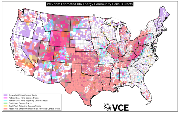
First, many parties seem to be exercising caution, and are waiting for the Treasury Department and the Internal Revenue Service to release official opinions about what qualifies as an energy community. The IRS is seeking input from the industry on IRA questions, which will include these energy community questions. We should expect more official answers in the future, though it’s not exactly clear when that information will be released.
Additionally, multiple parties have reached out to pv magazine USA to express that the validity of any specific maps is up for argument at this point. They have suggested that the employment numbers might be used incorrectly, that EPA brownfields aren’t defined, and that the coal mine data is incomplete.
With that in mind, several parties have put together their own maps of energy communities, intended for public consumption (with caveats of course). And entrepreneurs are already aggressively chasing land that is presumably eligible for the added incentive.
Vibrant Clean Energy (VCE) released an analysis of low income and energy communities census tracts (see map above), according to their interpretation of the IRA. VCE is a company known for its wind and solar power forecasts. In its analysis, the group identifies brownfield sites, former coal communities and power plants, and former fossil fuel regions (oil and gas).
VCE’s analysis of former fossil communities notes that regions that have previously been defined as energy communities had ‘at least 0.17 percent fossil fuel employment’, and greater than ‘35 percent tax revenues affected’. VCE also notes that this definition of an energy community is expected to change over time, and must be updated annually.
VCE also makes available shape files of these tracts on their website.
S&P Global has created a gif that identifies the energy communities.
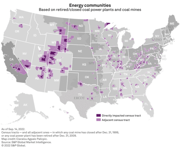
Based only on coal plant and mine closures, the group suggests that more than 2,800 individual census tracts would be eligible for the 10% adder. S&P Global Energy cites the EPA suggestion that there are between 500,000 and 1 million brownfield sites.
Census.gov states there are over 84,000 census tracts in the United States.
Resource.org has also put together its own maps, along with their sources, and a downloadable package of information for the more hands-on types. The group built their maps using EPA data for brownfield sites, EIA data for closed coal plants, and Office of Management and Budget maps for fossil fuel employment.
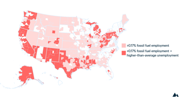
The most interesting part of the Resource.org maps is that they show how more than 39% of the United States could qualify for the 10% adder, based on fossil fuel employment and higher than average unemployment rates (shown in dark red in the map above).
Resource.org noted that they have an update coming to improve the accuracy of their maps, although the current model is already fairly accurate.
BTU Analytics, which provides market reports, consulting, and energy analysis tools, also released a series of maps. Their full maps and advanced data sets are available only to paying subscribers. In the team’s analysis they note there are still several questions to be answered before these maps finalize.
For example, they point out that geographic boundaries for brownfields are not publicly disclosed by the EPA and that they may vary in size from less than an acre to thousands of acres.
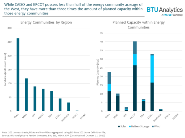
Data from BTU Analytics shows the volume of solar, wind, and energy storage projects that are already in the queue of various power grid regions, and are already located in energy communities. So far, there are already over 100 GW of projects in these queues.
Another interesting set of maps was put out by the global consulting firm Charles River Associates, and focuses specifically on the former coal communities of the United States. The authors note that as of 2022, a full 18% of the United States could be defined as former coal regions. That value is expected to increase to 20% or more by 2028, as additional coal facilities retire.
The group noted that they currently see 4,803 individual census tracts.
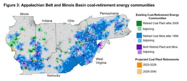
The region in the map above – from Illinois to Pennsylvania – is more than 46% covered with potentially viable census tracts. Nearly every tract in West Virginia is eligible, except for some land in the East.
Charles River Associates estimates that 59% of the three state regions of Utah, Wyoming, and Colorado are eligible.
Last, but certainly not least, are batch maps – along with their shape and data files – developed by Jesse Jenkins and the ZERO Lab team. While there are no specific details regarding the amount of eligible land, their map appears to show a very high percentage of potentially eligible regions.
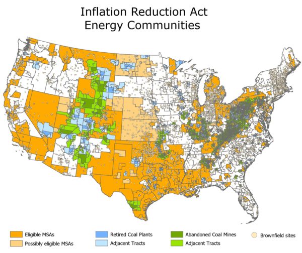
Documentations from analysts and from the press have noted the potential for very high percentages of the nation to qualify as energy community regions – even more than the 39% predicted by Resources.org
Remember, the 10% adder begins in 2023, so remain cautious with your financial models until the IRS releases their official positions and documentation. And don’t forget that these maps will evolve in the coming years as fossil facilities shut down, and as employment and revenue numbers fluctuate.
This article was amended on Oct. 31, 2022 to correct this sentence:
“These energy communities increase the available tax credit by 10% if prevailing wage and apprenticeship requirements are met or 2% if those requirements are not met for projects over 1 MWac.” Also additional clarification was added on residential projects.
This content is protected by copyright and may not be reused. If you want to cooperate with us and would like to reuse some of our content, please contact: editors@pv-magazine.com.






By submitting this form you agree to pv magazine using your data for the purposes of publishing your comment.
Your personal data will only be disclosed or otherwise transmitted to third parties for the purposes of spam filtering or if this is necessary for technical maintenance of the website. Any other transfer to third parties will not take place unless this is justified on the basis of applicable data protection regulations or if pv magazine is legally obliged to do so.
You may revoke this consent at any time with effect for the future, in which case your personal data will be deleted immediately. Otherwise, your data will be deleted if pv magazine has processed your request or the purpose of data storage is fulfilled.
Further information on data privacy can be found in our Data Protection Policy.