It feels like there’s been breaking news every few hours recently. To counter that, I wanted to step back and take stock of some long-run energy and climate trends. With the election in sight, I thought it would be worth pondering how the last four years under President Trump might have altered those trends.
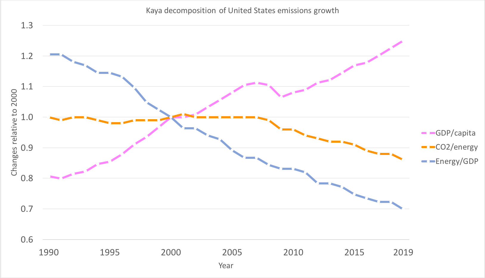
To do that, I’m presenting some basic statistics on US CO2 emissions and energy use in the graph below. All three data series are plotted relative to 2000. Given the Trump administration’s dedication to rolling back environmental policies, I was a bit surprised to see that, at a super high level, we don’t see a big trend break after 2016.
The Kaya Identity
The lines on this graph are part of the Kaya Identity, which is a helpful way to decompose what’s going on with CO2 emissions. Specifically, you can imagine four broad ways to reduce U.S. CO2 emissions from energy:
- Shrink the population, so there are fewer people using energy,
- Reduce economic output (Gross Domestic Product – GDP) per capita, so we’re making less stuff using energy,
- Use less energy per dollar of GDP, or
- Emit less CO2 per unit of energy.
Leaving aside the attack ads that many Republicans are launching at Democrats, no one really is proposing the first two bullets as policy levers for addressing climate change. I haven’t plotted population trends in the graph above, but it’s marching up at a nice, steady growth rate of a little less than 1% per year and that’s not likely to change dramatically. (See Andy’s blog on population and energy trends.) The pink line (at the top on the right hand side of the graph) reflects GDP per capita. You can see the line dip with the Great Recession in 2008-09 and when we have the 2020 numbers, they will show a drop, but in general, this increases steadily at a little more than 1% per year, which generally means more jobs, prosperity, iPhones, etc.
The interesting lines are in orange and blue, which show, respectively, CO2 per unit of energy and energy per dollar of GDP. Both of these have been declining pretty steadily since 2000. To my mind, the blue line reflects what’s happening on the demand side of the energy sector – are we able to do the same economic activities more efficiently? The orange line reflects what’s happening on the supply side – are we able to produce the same amount of energy emitting less CO2?
Beginning in 2008, we started to see less CO2 emitted per unit of energy production, mainly as we added more renewable electricity to the grid and switched from coal to gas for electricity production. The Energy Information Administration calculates that the coal to gas switch accounted for over 60% of the decline. (See Figure 10 here.)
Energy efficiency has been improving pretty steadily for the last 30 years, for example as we deploy more LED light bulbs, improve overall productivity or shift energy-intensive industries abroad. There are a number of papers that analyze this trend – here’s one that I know of.
Why isn’t the Trump effect more obvious?
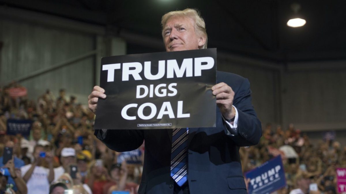
Given President Trump’s rhetoric about saving coal and the despair that many environmentally minded people experienced in November 2016, it may be a little surprising that the Trump effect can’t be seen in the trends so far. (Meredith blogged about the Trump effect on local air pollution – it’s less rosy.) In part, this likely reflects the fact that a lot of energy policy decisions are made at the state level. For example, California, like 34 other states, has a renewable portfolio/clean energy standard, which forces the CO2 emissions from electricity production down.
Image: Energy institute Blog
President Trump’s inability to control these trends also reflects the fact that there are market forces driving American’s decisions about energy consumption and production. For example, the rapid decline in the price of LED lighting has led to dramatic reductions in the electricity used by the residential and commercial sectors (see Lucas’ earlier blog) and the decline in natural gas prices spurred the coal to gas switch. And, many of these markets are global. Prices for solar photovoltaics and wind turbines have fallen a lot, so some of the renewable electricity is being installed because it’s the cheapest option, not because of a renewable portfolio standard or other policies (at least not directly).
One concern might be that today’s policy decisions drive tomorrow’s market trends. I would like to see an analysis of the extent to which LED price drops were inspired by energy efficiency policies. My read of the solar price decline is that market forces – capitalists trying to make a better mousetrap, so to speak – are an important part of the story.
But, it’s also true that we don’t know what the blue or orange lines would have looked like under a Hillary Clinton administration – maybe they would have declined faster. And, the trends over the next 10 years might have been different if she had become president in 2016.
Comparing the US to the rest of the world
Another concern is that the US has made progress by exporting its energy- and carbon-intensive activities to other parts of the world, like China. If the US economy is more service oriented, and its manufacturing is moving to other parts of the world, then we’ll see the orange and the blue lines falling locally, but going up elsewhere.
The figure below, from the Global Carbon Project, reflects the worldwide trends. (Thank you to Armond Cohen for pointing me to them. To make it easier to compare, I copied their color scheme and normalized to the same year).
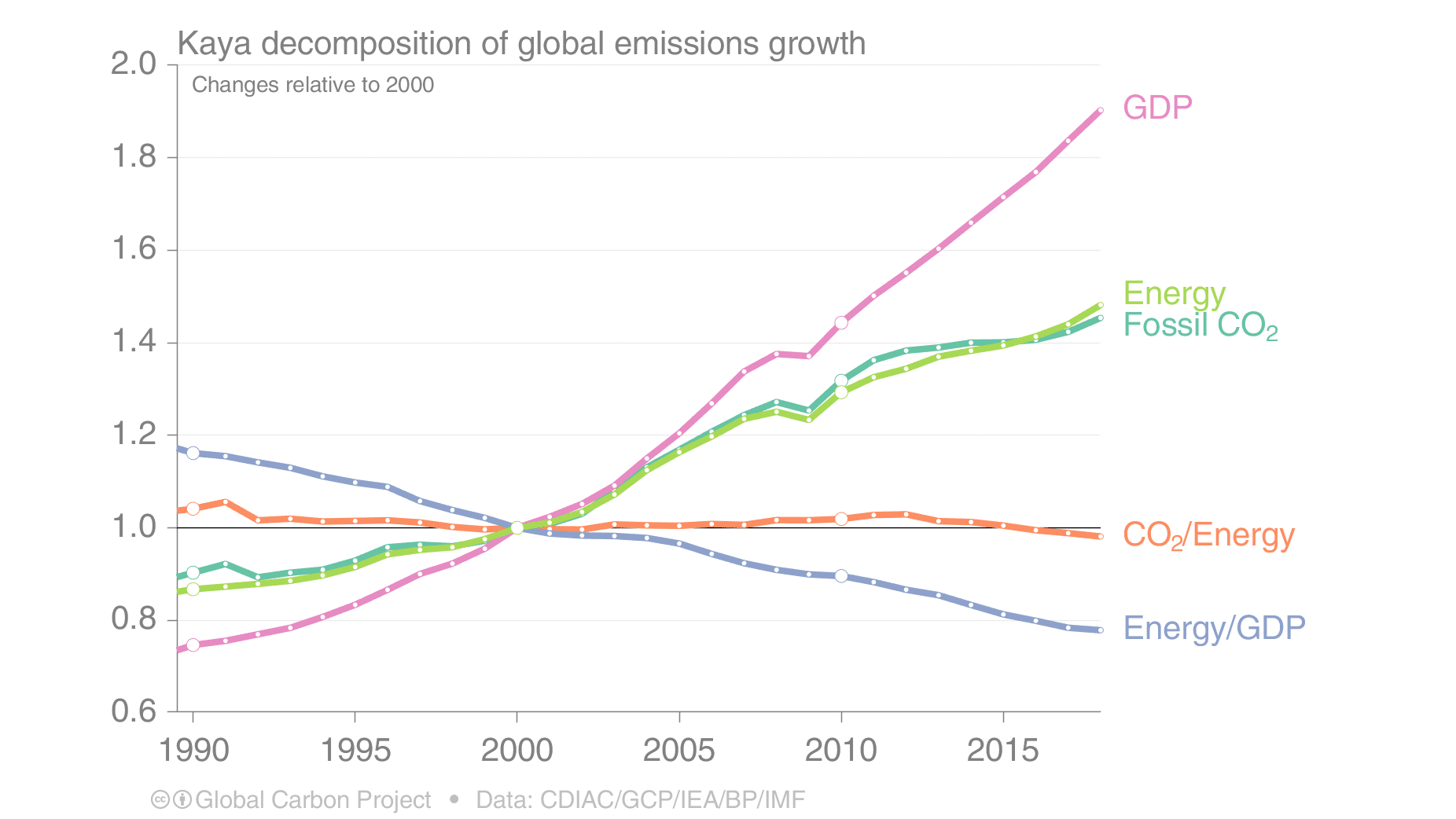
The downward trends in the blue and orange lines are less pronounced worldwide than they are in the U.S., but there’s also no evidence that the U.S. reductions have led to increases elsewhere. The U.S. consumes only 17% of worldwide energy, so a 20% drop in energy use per unit of GDP worldwide, could not be driven by a 30% reduction in the US and growth elsewhere. This figure suggests that CO2/Energy is falling in the world’s largest emitting countries, though not as much as in the U.S. One optimistic view is that the U.S., and other countries that have seen recent declines, are leading the rest of the world in decarbonizing the energy sector, and that other countries will see similar declines in CO2 in the future.
Big systems with long-lived assets, like the worldwide energy sector, are hard to redirect. That’s a good thing for those of us worried about the damages President Trump has wrought, but it also emphasizes just how hard it will be to get massive reductions in CO2.
***
Catherine Wolfram is Associate Dean for Academic Affairs and the Cora Jane Flood Professor of Business Administration at the Haas School of Business, University of California, Berkeley. Her work has analyzed rural electrification programs in the developing world, energy efficiency programs in the US, the effects of environmental regulation on energy markets and the impact of privatization and restructuring in the U.S. and UK. This article originally appeared on the Energy Institute blog.
The views and opinions expressed in this article are the author’s own, and do not necessarily reflect those held by pv magazine.
This content is protected by copyright and may not be reused. If you want to cooperate with us and would like to reuse some of our content, please contact: editors@pv-magazine.com.


By submitting this form you agree to pv magazine using your data for the purposes of publishing your comment.
Your personal data will only be disclosed or otherwise transmitted to third parties for the purposes of spam filtering or if this is necessary for technical maintenance of the website. Any other transfer to third parties will not take place unless this is justified on the basis of applicable data protection regulations or if pv magazine is legally obliged to do so.
You may revoke this consent at any time with effect for the future, in which case your personal data will be deleted immediately. Otherwise, your data will be deleted if pv magazine has processed your request or the purpose of data storage is fulfilled.
Further information on data privacy can be found in our Data Protection Policy.